This collection features a selection of logo design projects developed for a range of clients, from small brands to personal passion projects. Each logo was created to reflect the unique identity, values, and personality of the brand it represents—whether through custom typography, symbolic imagery, or bold simplicity.
FUNDACIÓN MACHUS SUANZES
The Machus Suanzes Foundation is a non-profit organization founded by Ricardo La Porte Ríos and María Jesús Suanzes de Mercader, a Spanish couple who decided to dedicate part of their inheritance to social projects in Africa. This logo was designed at their request.

The typographic play with the shared final S reinforces the idea of unity, continuity, and legacy, symbolizing the passing of a purpose from one generation to the next. The small handprints within its curves suggest that every action, no matter how small, leaves a mark.

At the same time, this symbolic S can also be read as a representation of the founders themselves: two intertwined paths that have walked together throughout their lives and now come together in a shared gesture of giving.
AMORA
Amora blends music and art to create heartfelt, personalized gifts. The logo builds on the brand name, turning the “M” into a three-stem musical note, symbolizing creativity, emotion, and harmony.
In collaboration with singer and songwriter CarlotaMad, we craft original songs paired with unique collage-style illustrations, inspired by meaningful details about the person receiving the gift—including a personal photo.


The final piece includes a custom song, a visually rich illustration, and a QR code linking to a private YouTube video, so the recipient can revisit their song anytime. Perfect for weddings, birthdays, anniversaries, communions, or corporate events—any moment worth remembering.
To hear an example, click the video below.
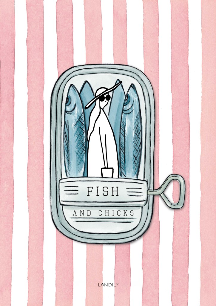
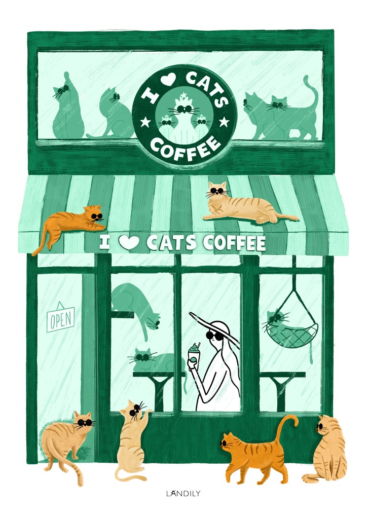
LANDILY
Landily is the Land of Lily Queen, a fictional illustrated world centered around the character of Lily Queen, a curious traveler who loves hats and sunglasses and explores the planet through a playful and humorous lens.
Landily’s logo plays creatively with the brand name, transforming the letter ‘A’ into a stylized representation of Lily herself. A small hat sits atop the peak of the ‘A’, while two circles placed over its horizontal bar evoke her iconic sunglasses, turning a simple letter into a playful, character-driven symbol.